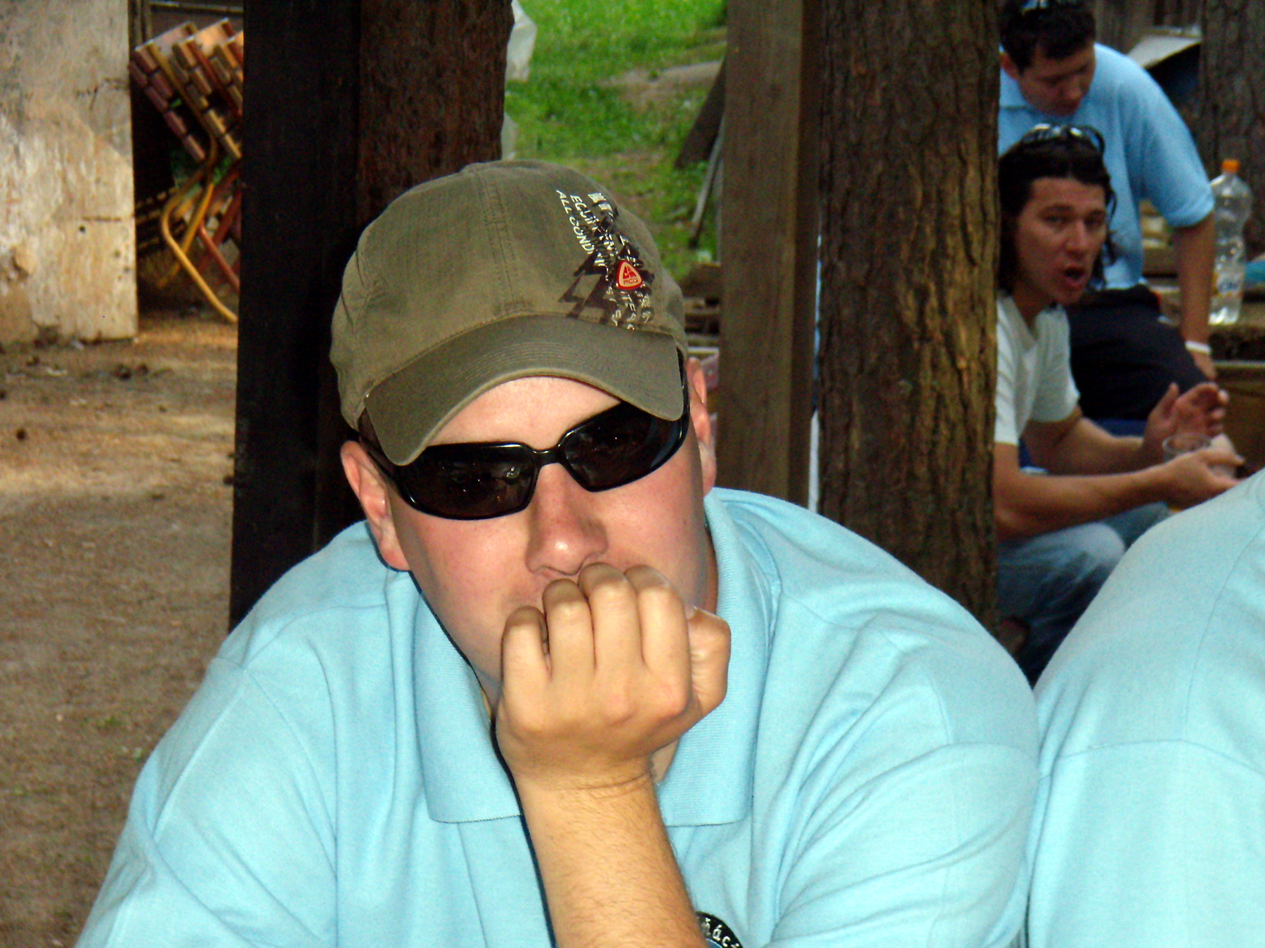
Galerie: Cyklovýlet na Sycherák

|
Komentář ze dne 21.07.2013 18:16:51 Reagovat
Autor hRRE3oAf1k7 E-mail: helenr@hpforum.org.nz IP: 198-46-129-32-host.colocrossing.com Titulek: 1PK1ru76 I was basically wntiang to know if you
ever thought of switching the page
layout of your website? It is very well
written; I really like what youve got to
state. But maybe you could create a
little more in the way of content so
people could connect with it better. You
have got an awful lot of wording for
only having one or two graphics. Maybe
you could space it out better? |
|
Komentář ze dne 21.07.2013 18:16:52 Reagovat
Autor hRRE3oAf1k7 E-mail: helenr@hpforum.org.nz IP: 198-46-129-32-host.colocrossing.com Titulek: 1PK1ru76 I was basically wntiang to know if you
ever thought of switching the page
layout of your website? It is very well
written; I really like what youve got to
state. But maybe you could create a
little more in the way of content so
people could connect with it better. You
have got an awful lot of wording for
only having one or two graphics. Maybe
you could space it out better? |